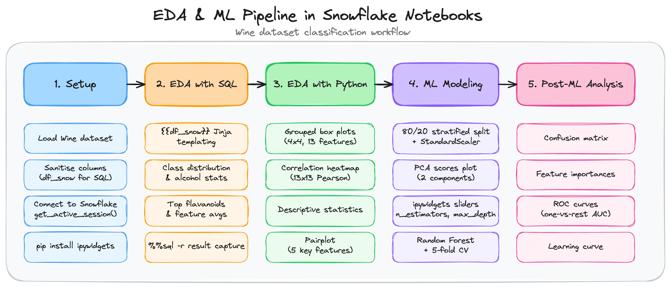
Getting Started with Snowflake Notebooks in Workspaces: Build an EDA and ML Pipeline
Overview
As a data scientist, setting up a local environment for each new project (i.e. installing packages, configuring database connections, and managing dependencies) takes time away from what matters: exploring data and building models. Snowflake Notebooks in Workspaces removes that friction by providing a cell-based, interactive environment for Python and SQL that runs directly inside Snowflake. You get access to your data, scalable compute, and a curated package library without leaving the platform.
This guide walks you through a realistic data science workflow using the Wine dataset — from loading data and writing SQL queries to producing visualizations and training a classification model, all inside a single Snowflake Notebook.
The pipeline covers five sequential stages:
| Step | Section | What you do |
|---|---|---|
| 1 | Setup | Load the Wine dataset, write it to a Snowflake temp table |
| 2 | EDA with SQL | Class balance, per-class aggregations, ranked queries |
| 3 | EDA with Python | Grouped box plots, 13x13 correlation heatmap, pairplot |
| 4 | Machine Learning Modeling | Train/test split, PCA scores, Random Forest + cross-validation |
| 5 | Post-ML Analysis | Confusion matrix, feature importances, ROC curves, learning curve |
Prerequisites
- Basic familiarity with Python and SQL.
- A Snowflake account. Sign up for a 30-day free trial if required.
- Cortex Code (optional) — not required if you use the provided code snippets directly. Needed if you want to use the Prompt sections to generate or extend the code interactively.
What You'll Learn
- How to load an in-memory Python dataset into a pandas DataFrame and reference it from SQL cells using Jinja templating.
- How SQL cells return Snowpark pandas (snowpandas) DataFrames by default in Container Runtime 2.6 or higher, and how to convert them to pandas with
.to_pandas()when needed. - How to produce publication-quality EDA visualizations (box plots, heatmaps, pairplots) inside a Notebook.
- How to train and evaluate a Random Forest classifier with interactive
ipywidgetssliders for hyperparameters. - How to interpret post-training diagnostics: confusion matrices, feature importances, ROC curves, and learning curves.
What You'll Need
- Access to Snowflake Workspaces and a Compute Pool.
- The getting-started-with-snowflake-notebooks-in-workspaces-eda-ml-pipeline.ipynb notebook file from the Snowflake Demo Notebooks repo.
What You'll Build
An end-to-end classification pipeline on the Wine dataset:
- An in-memory pandas DataFrame (
df_snow) holding 178 samples and 13 chemical features, referenced directly from SQL cells via Jinja templating. - SQL EDA queries revealing class balance, alcohol statistics, and top samples by flavanoid content.
- Python EDA charts including grouped box plots and a 13x13 correlation heatmap.
- A trained
RandomForestClassifierwith interactive hyperparameter sliders, evaluated via 5-fold cross-validation. - Post-ML diagnostic charts: confusion matrix, feature importances, ROC curves, and learning curve.
Import the Notebook into Snowflake
Step 1 — Download the notebook
- Go to the repo page with the getting-started-with-snowflake-notebooks-in-workspaces-eda-ml-pipeline.ipynb notebook file, then click Download raw file (top-right icon).
Step 2 — Import into Snowsight
- Log in to Snowsight.
- Navigate to Projects > Workspaces in the left sidebar.
- In the Workspaces tab on the left pane, click on + Add new, then Upload files.
- Select the
.ipynbnotebook file from your local computer that you've already downloaded in step 1 and click Open. - From the Workspaces tab on the left pane, click on the notebook file to open it up. Next, click on the "Connect" widget so that it connects to the compute service.
Step 3 — Switch to Container Runtime
This notebook uses packages such as scikit-learn, seaborn, and ipywidgets that are available on Container Runtime. This guide was developed and tested with Container Runtime 2.6 (CPU).
- Open the notebook and in the top Connect/Connected widget, click on the drop-down to create a new service or edit an existing service to use runtime version 2.6 or higher.
- Click on the Connect widget to start the service and wait for the container to start (typically under 60 seconds).
Setup: Load the Wine Dataset
The first section loads the scikit-learn Wine dataset into a pandas DataFrame, connects to Snowflake, and prepares a SQL-safe copy of the DataFrame called df_snow. SQL cells in the notebook reference df_snow directly via Jinja templating ({{df_snow}}), so no explicit table upload is needed.
Prompt
Use this prompt with an AI coding assistant to extend this section:
Load the scikit-learn Wine dataset into a pandas DataFrame. Sanitise column names
by replacing / with _ so they are safe to use in SQL. Print the dataset shape,
feature names, and class names.
Load the Wine Dataset
import re
import pandas as pd
from sklearn.datasets import load_wine

# Load Wine dataset into a pandas DataFrame
wine = load_wine()
df = pd.DataFrame(wine.data, columns=wine.feature_names)
df['cultivar'] = wine.target
df['cultivar_name'] = df['cultivar'].map({0: 'Cultivar 0', 1: 'Cultivar 1', 2: 'Cultivar 2'})

print(f"Dataset shape: {df.shape}")
print(f"Features: {list(wine.feature_names)}")
print(f"Classes: {list(wine.target_names)}")

# Sanitise column names for SQL (replace / with _)
def safe_col(name):
    return re.sub(r'[^a-zA-Z0-9_]', '_', name)

df_snow = df.rename(columns={c: safe_col(c) for c in df.columns})
print(f"\ndf_snow columns: {list(df_snow.columns)}")
The df_snow DataFrame is identical to df except its column names replace / with _ — required because the SQL Jinja templating syntax ({{df_snow}}) does not accept slashes in column names.
Install Packages
! pip install ipywidgets
ipywidgets provides interactive sliders for the hyperparameter tuning section. It is not pre-installed on Container Runtime.
Connect to Snowflake
from snowflake.snowpark.context import get_active_session

session = get_active_session()
print(f'Connected as : {session.get_current_user()}')
print(f'Role         : {session.get_current_role()}')
print(f'Warehouse    : {session.get_current_warehouse()}')

result = session.sql('SELECT CURRENT_TIMESTAMP() AS now, CURRENT_VERSION() AS sf_version').collect()
for row in result:
    print(f'Timestamp : {row["NOW"]}')
    print(f'SF version: {row["SF_VERSION"]}')
get_active_session() connects to the Snowflake session that is already attached to the running notebook — no credentials are required.
The notebook does not explicitly write df_snow to WINE_TMP in a separate cell; instead, SQL cells reference the DataFrame directly via Jinja templating ({{df_snow}}), which Snowflake Notebooks evaluates at query time.
What Gets Generated
Running this section prints the dataset dimensions, feature list, class names, and Snowflake session details:
Dataset shape: (178, 15)
Features: ['alcohol', 'malic_acid', 'ash', 'alcalinity_of_ash', 'magnesium',
           'total_phenols', 'flavanoids', 'nonflavanoid_phenols', 'proanthocyanins',
           'color_intensity', 'hue', 'od280/od315_of_diluted_wines', 'proline']
Classes: ['class_0', 'class_1', 'class_2']

df_snow columns: ['alcohol', 'malic_acid', 'ash', 'alcalinity_of_ash', 'magnesium',
                  'total_phenols', 'flavanoids', 'nonflavanoid_phenols', 'proanthocyanins',
                  'color_intensity', 'hue', 'od280_od315_of_diluted_wines', 'proline',
                  'cultivar', 'cultivar_name']

Connected as : JANE_DOE
Role         : SYSADMIN
Warehouse    : COMPUTE_WH
Timestamp : 2026-06-19 10:00:00.000
SF version: 8.x.x
EDA with SQL
With df_snow in memory, SQL cells can reference it directly using the {{df_snow}} Jinja syntax. Snowflake Notebooks evaluates the template at query time, serialises the DataFrame, and executes the query — all transparently.
SQL cells use the %%sql cell magic. Adding -r <variable_name> captures the result as a Snowpark pandas (snowpandas) DataFrame for use in subsequent Python cells. In Container Runtime 2.6 and later, SQL cell results are returned as Snowpark pandas DataFrames by default — if a downstream operation requires a regular pandas DataFrame, call .to_pandas() on the result:
%%sql -r df_result
SELECT ... FROM {{df_snow}}
# Convert to pandas if needed for downstream pandas operations
df_result_pd = df_result.to_pandas()
Prompt
Use this prompt with an AI coding assistant to extend this section with more advanced SQL patterns:
Using a Snowpark session in a Snowflake Notebook, write four SQL cells that
reference a pandas DataFrame via Jinja templating ({{df_snow}}): (1) count
samples per cultivar with percentage of total using a window function, (2)
compute a five-number summary (min, Q1, median, Q3, max) of alcohol content
grouped by cultivar using PERCENTILE_CONT, (3) rank the top 3 samples per
cultivар by flavanoid content using RANK() OVER (PARTITION BY), and (4) compute
per-feature average by cultivar using a single-scan UNPIVOT + PIVOT instead of
multiple UNION ALL subqueries.
Class Distribution
%%sql -r df_class_dist
SELECT
    cultivar,
    cultivar_name,
    COUNT(*) AS sample_count
FROM {{df_snow}}
GROUP BY cultivar, cultivar_name
ORDER BY cultivar
This query confirms whether the dataset is balanced across the three Wine cultivar classes (0, 1, 2).
Alcohol Stats per Cultivar
%%sql -r df_alcohol_stats
SELECT
    cultivar_name,
    ROUND(MIN(alcohol), 3)  AS min_alcohol,
    ROUND(AVG(alcohol), 3)  AS avg_alcohol,
    ROUND(MAX(alcohol), 3)  AS max_alcohol
FROM {{df_snow}}
GROUP BY cultivar_name
ORDER BY cultivar_name
The %%sql -r <variable> magic captures the result into a Python variable (df_alcohol_stats) for downstream use in Python cells.
Top Samples by Flavanoid Content
%%sql -r df_top_flavanoids
SELECT
    cultivar_name,
    ROUND(alcohol, 3)    AS alcohol,
    ROUND(flavanoids, 3) AS flavanoids,
    ROUND(proline, 0)    AS proline
FROM {{df_snow}}
ORDER BY flavanoids DESC
LIMIT 9
Average Feature Values per Cultivar
%%sql -r df_feature_avgs
SELECT
    cultivar_name,
    ROUND(AVG(alcohol), 3)         AS avg_alcohol,
    ROUND(AVG(flavanoids), 3)      AS avg_flavanoids,
    ROUND(AVG(color_intensity), 3) AS avg_color_intensity,
    ROUND(AVG(proline), 3)         AS avg_proline
FROM {{df_snow}}
GROUP BY cultivar_name
ORDER BY cultivar_name
This reveals how the three cultivars differ on the features most commonly used in Wine classification tasks.
What Gets Generated
Each SQL cell returns a result table rendered inline in the notebook. For example, the class distribution query returns:
  cultivar  cultivar_name  sample_count
0        0    Cultivar 0            59
1        1    Cultivar 1            71
2        2    Cultivar 2            48
And the alcohol stats query returns:
  cultivar_name  min_alcohol  avg_alcohol  max_alcohol
0   Cultivar 0        11.45       13.745        14.83
1   Cultivar 1        11.03       12.279        14.10
2   Cultivar 2        11.03       13.153        14.34
EDA with Python
Python-based EDA focuses on the shape of the data — how features are distributed across cultivar classes and how strongly they correlate with each other.
Prompt
Use this prompt with an AI coding assistant to extend this section:
Using matplotlib and seaborn, produce three visualisations for the Wine dataset:
(1) a grid of grouped box plots showing the distribution of every feature broken
out by cultivar, (2) a lower-triangle 13x13 Pearson correlation heatmap with
annotated coefficients, and (3) a pairplot of the five most discriminative
features coloured by cultivar class.
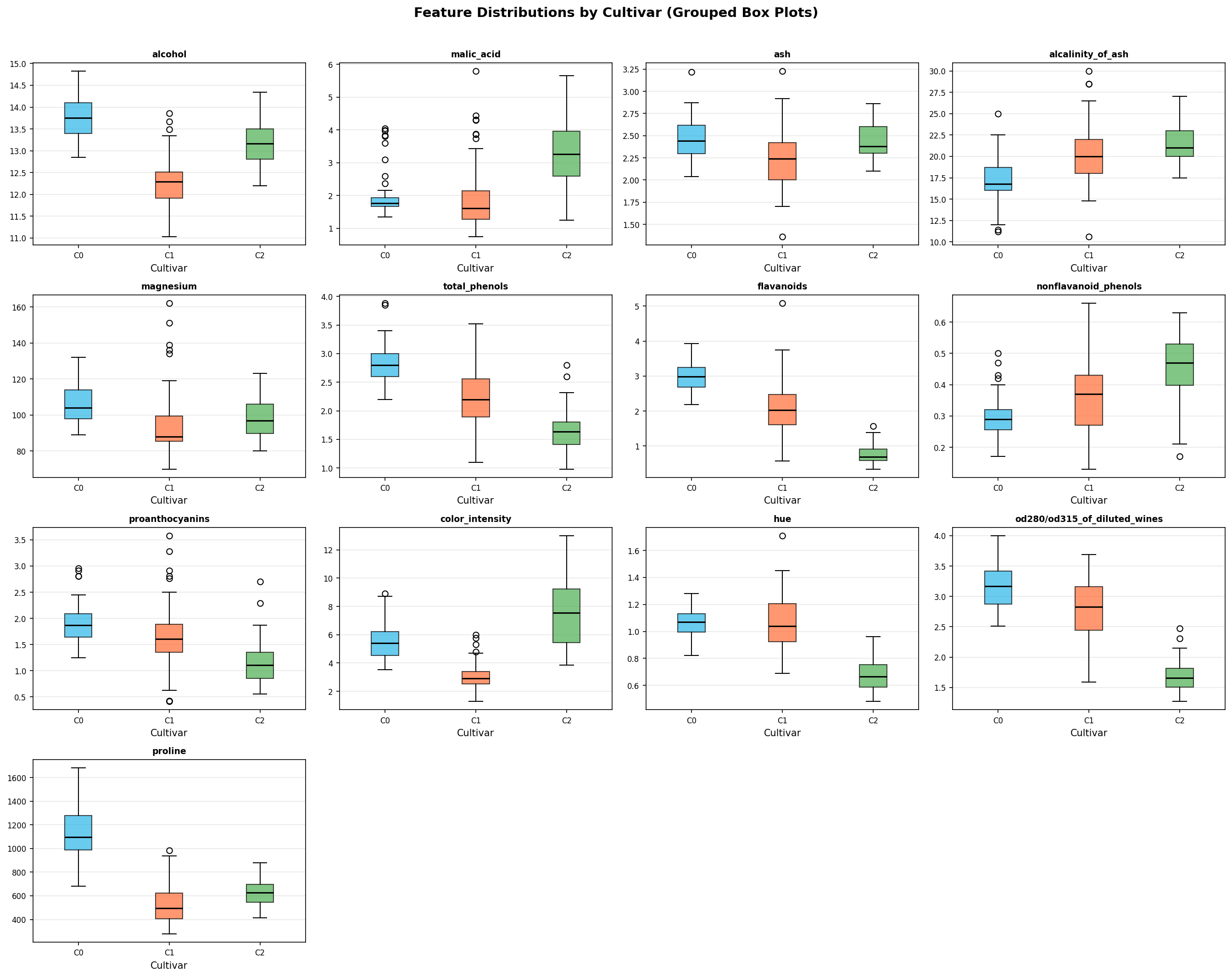
Grouped Box Plots
import matplotlib.pyplot as plt

features = wine.feature_names
n_cols = 4
n_rows = (len(features) + n_cols - 1) // n_cols

fig, axes = plt.subplots(n_rows, n_cols, figsize=(18, n_rows * 3.5))
axes = axes.flatten()
colors = ['#29B5E8', '#FF6B35', '#4CAF50']

for i, feat in enumerate(features):
    ax = axes[i]
    data_by_class = [df[df['cultivar'] == c][feat].values for c in [0, 1, 2]]
    bp = ax.boxplot(data_by_class, patch_artist=True, tick_labels=['C0', 'C1', 'C2'],
                    medianprops=dict(color='black', linewidth=1.5))
    for patch, color in zip(bp['boxes'], colors):
        patch.set_facecolor(color)
        patch.set_alpha(0.7)
    ax.set_title(feat, fontsize=9, fontweight='bold')
    ax.grid(True, alpha=0.3, axis='y')

for j in range(len(features), len(axes)):
    axes[j].set_visible(False)

fig.suptitle('Feature Distributions by Cultivar (Grouped Box Plots)', fontsize=14, fontweight='bold')
plt.tight_layout()
plt.show()
The 4x4 grid of box plots shows how each of the 13 chemical features is distributed across the three cultivar classes. Features such as flavanoids and proline show strong class separation — they are good candidates for classification.
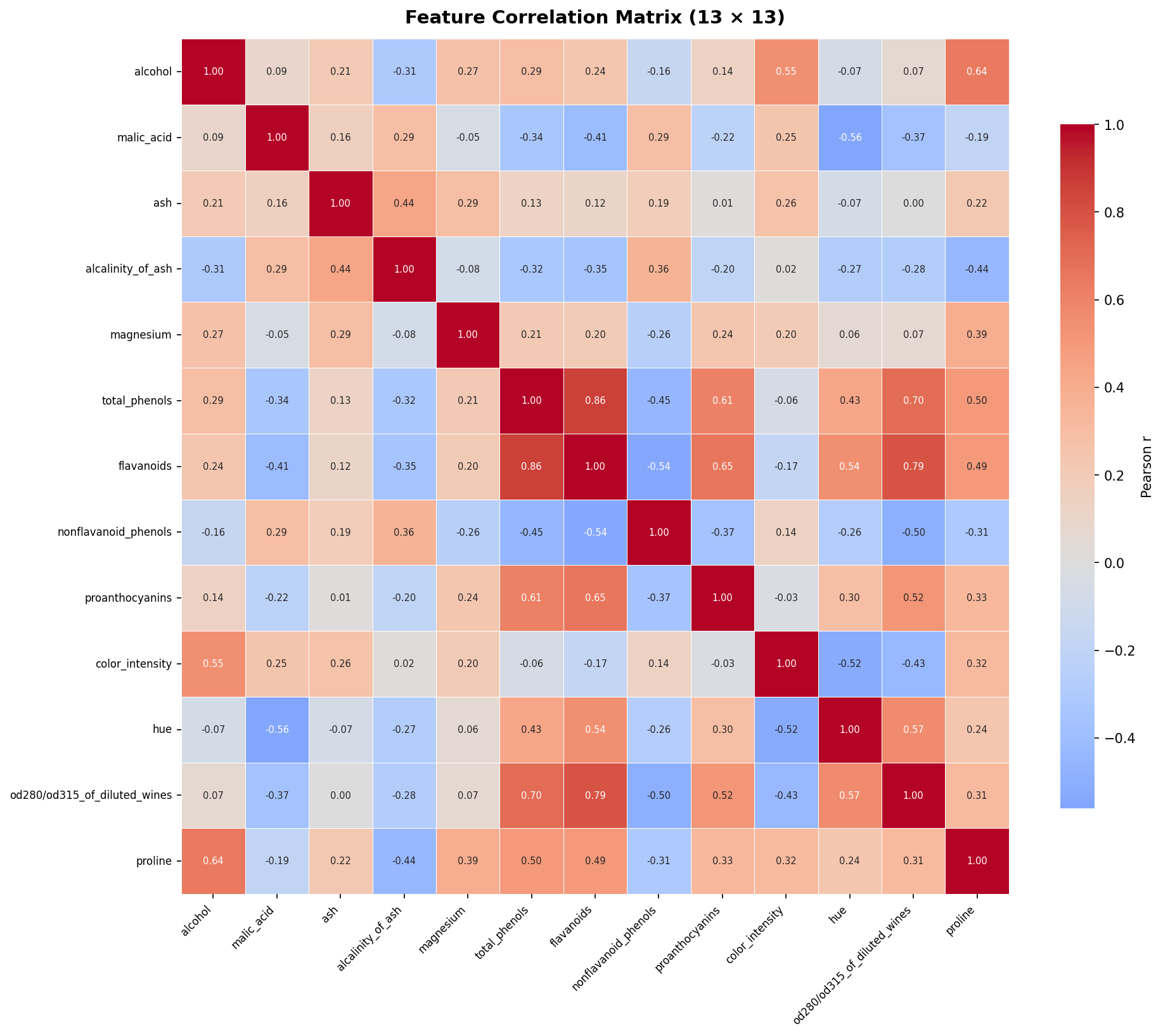
Correlation Heatmap
import numpy as np
import seaborn as sns

numeric_df = df[list(wine.feature_names)]
corr = numeric_df.corr()

fig, ax = plt.subplots(figsize=(13, 11))
sns.heatmap(
    corr,
    annot=True, fmt='.2f',
    cmap='coolwarm', center=0,
    linewidths=0.4,
    annot_kws={'size': 7},
    ax=ax
)
ax.set_title('Feature Correlation Matrix (13x13)', fontsize=14, fontweight='bold')
plt.tight_layout()
plt.show()
The 13x13 heatmap annotates every Pearson correlation coefficient. Notable strong correlations include flavanoids and total_phenols (r ≈ 0.86) — meaning these features carry similar information and one could be dropped to reduce multicollinearity before modeling.
Descriptive Statistics
stats = df[list(wine.feature_names)].describe().T.round(3)
print(stats.to_string())
This prints count, mean, std, min, 25th/50th/75th percentile, and max for all 13 features in a single transposed table — useful for spotting scale differences before applying StandardScaler.
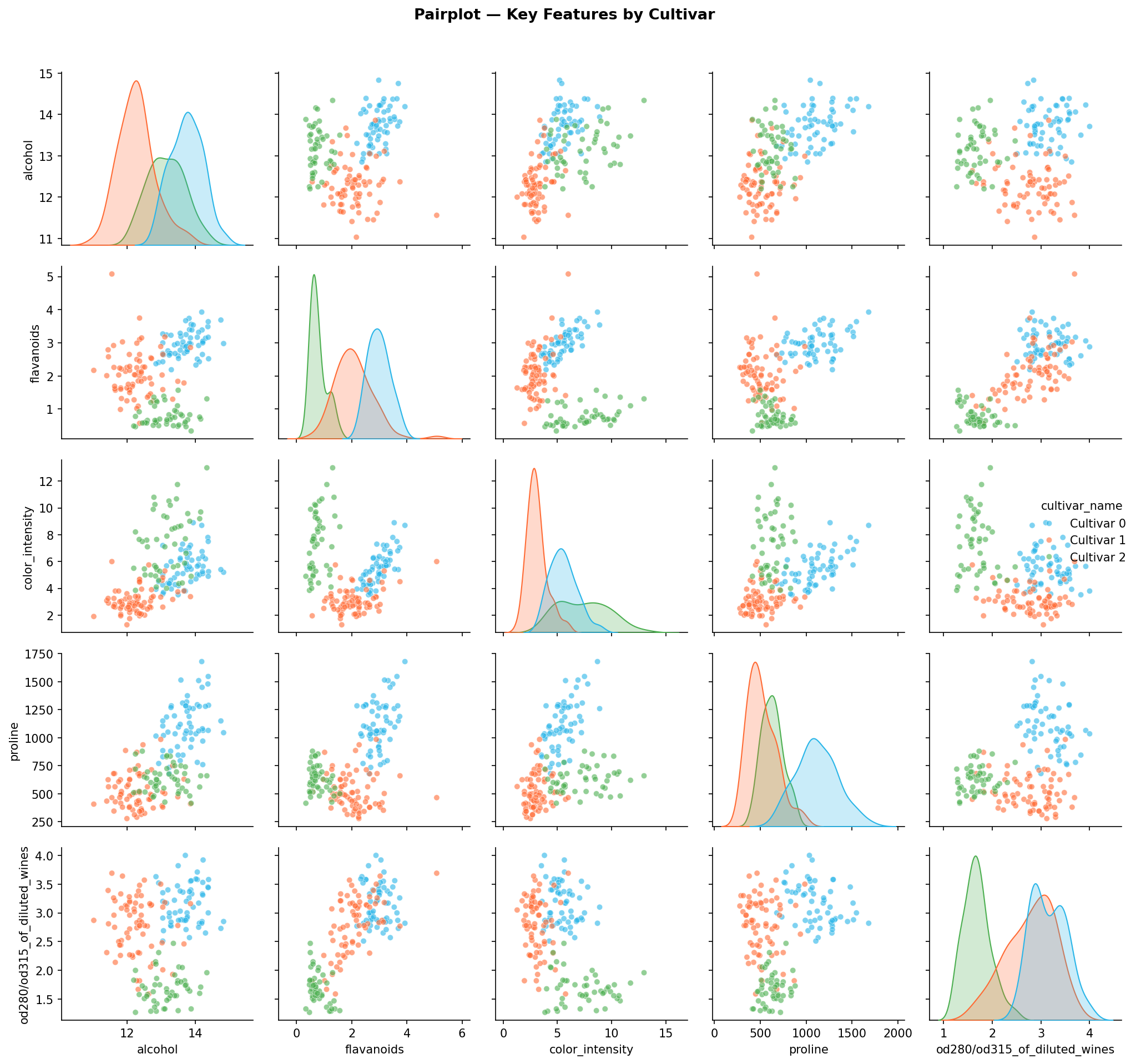
Pairplot — Key Features by Cultivar
key_features = ['alcohol', 'flavanoids', 'color_intensity', 'proline',
                'od280/od315_of_diluted_wines']
pair_df = df[key_features + ['cultivar_name']].copy()

palette = {'Cultivar 0': '#29B5E8', 'Cultivar 1': '#FF6B35', 'Cultivar 2': '#4CAF50'}
g = sns.pairplot(pair_df, hue='cultivar_name', palette=palette,
                 plot_kws={'alpha': 0.6, 's': 25}, diag_kind='kde')
g.figure.suptitle('Pairplot — Key Features by Cultivar', y=1.02, fontsize=13, fontweight='bold')
plt.tight_layout()
plt.show()
The pairplot of the 5 most discriminative features shows near-linear separability between cultivar classes in 2D projections — a strong signal that a linear or tree-based classifier should achieve high accuracy.
What Gets Generated
Three figures are rendered inline in the notebook:
Grouped box plots — a 4x4 grid showing the distribution of all 13 features split by cultivar class. Features like flavanoids and proline show clean separation between classes:
Correlation heatmap — a 13x13 annotated Pearson correlation matrix. Strong positive correlations appear between flavanoids and total_phenols (r ≈ 0.86):
Pairplot — scatter matrix of the 5 most discriminative features coloured by cultivar, showing near-linear separability:
Machine Learning Modeling
This section preprocesses the data, visualizes the train/test split in PCA space, exposes interactive hyperparameter sliders, trains a Random Forest, and evaluates it with cross-validation.
Prompt
Use this prompt with an AI coding assistant to extend this section:
Split the Wine dataset 80/20 with stratification and scale features using
StandardScaler. Fit a PCA with 2 components and plot the scores coloured by
(a) train/test split and (b) cultivar class in side-by-side scatter plots. Add
ipywidgets IntSlider widgets for n_estimators (range 10-500, step 10) and
max_depth (range 1-20), then train a RandomForestClassifier reading those slider
values, report test-set accuracy, and run 5-fold cross-validation on the full
dataset.
Preprocessing: Train/Test Split and Scaling
from sklearn.model_selection import train_test_split
from sklearn.preprocessing import StandardScaler

X = df[list(wine.feature_names)].values
y = df['cultivar'].values

X_train, X_test, y_train, y_test = train_test_split(
    X, y, test_size=0.2, random_state=42, stratify=y
)

scaler = StandardScaler()
X_train_scaled = scaler.fit_transform(X_train)
X_test_scaled = scaler.transform(X_test)

print(f"Train set: {X_train_scaled.shape[0]} samples")
print(f"Test set:  {X_test_scaled.shape[0]} samples")
An 80/20 stratified split is used so that the class proportions are preserved in both train and test sets. StandardScaler is fit only on the training set to avoid data leakage — it is then applied to the test set using the training-set statistics.
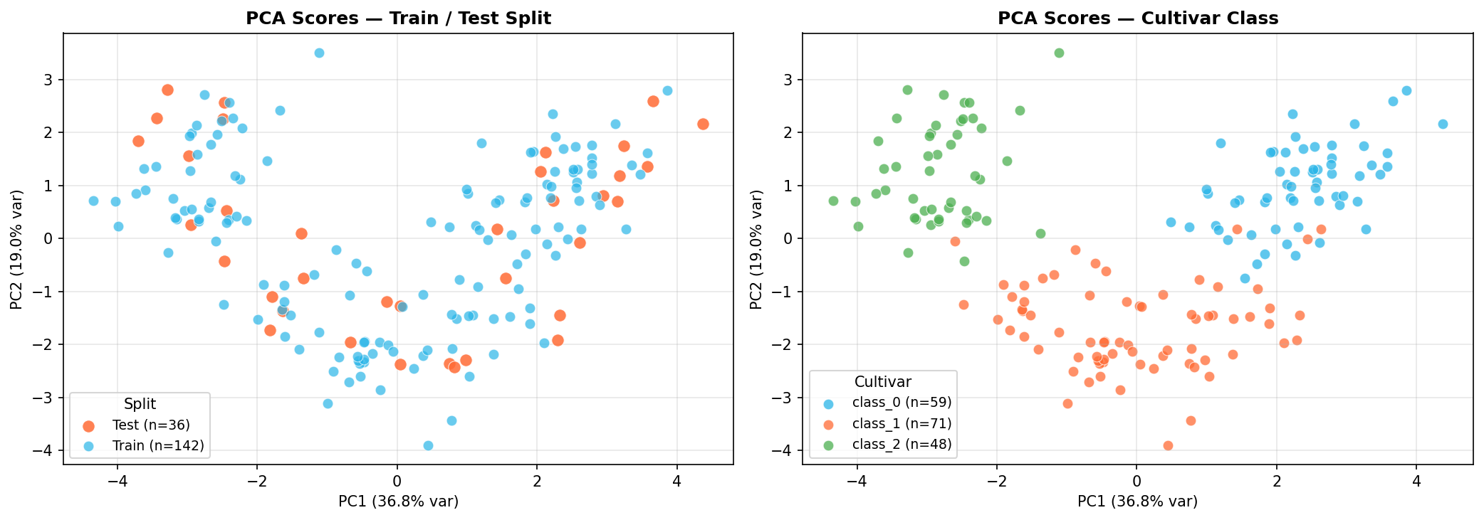
PCA Scores Panel Plot
from sklearn.decomposition import PCA

X_full = df[list(wine.feature_names)].values
X_full_scaled = scaler.transform(X_full)

pca = PCA(n_components=2, random_state=42)
X_pca = pca.fit_transform(X_full_scaled)
var_explained = pca.explained_variance_ratio_ * 100
The PCA scores plot has two panels:
- Left: train samples (blue) and test samples (orange) overlaid in 2D PCA space — confirming the split is representative and not accidentally grouped in one region.
- Right: the same points coloured by cultivar class — confirming that the three classes are largely linearly separable in the first two principal components.
Interactive Hyperparameter Sliders
import ipywidgets as widgets
from IPython.display import display

n_estimators_slider = widgets.IntSlider(
    value=100, min=10, max=500, step=10,
    description='n_estimators:',
    style={'description_width': 'initial'},
    continuous_update=False
)

max_depth_slider = widgets.IntSlider(
    value=5, min=1, max=20, step=1,
    description='max_depth:',
    style={'description_width': 'initial'},
    continuous_update=False
)

print('Adjust sliders then run the next cell to train the model.')
display(n_estimators_slider, max_depth_slider)
Adjust the sliders, then run the next cell. The model will be retrained with the new values each time you run it.
Train Random Forest and Cross-Validate
from sklearn.ensemble import RandomForestClassifier
from sklearn.model_selection import cross_val_score

n_estimators = n_estimators_slider.value
max_depth = max_depth_slider.value

rf = RandomForestClassifier(n_estimators=n_estimators, max_depth=max_depth, random_state=42)
rf.fit(X_train_scaled, y_train)

test_accuracy = rf.score(X_test_scaled, y_test)
print(f"Test set accuracy: {test_accuracy:.4f} ({test_accuracy*100:.1f}%)")

cv_scores = cross_val_score(rf, scaler.transform(X), y, cv=5, scoring='accuracy')
print(f"\n5-Fold Cross-Validation:")
print(f"  Scores: {[f'{s:.3f}' for s in cv_scores]}")
print(f"  Mean:   {cv_scores.mean():.4f} +/- {cv_scores.std():.4f}")
Classification Report
from sklearn.metrics import classification_report

y_pred = rf.predict(X_test_scaled)
print(classification_report(y_test, y_pred, target_names=wine.target_names))
The per-class precision, recall, and F1-score confirm which cultivar classes (if any) are harder for the model to distinguish.
What Gets Generated
The PCA scores panel confirms the split is representative and that cultivars are linearly separable in 2D PCA space:
The Random Forest training cell prints accuracy and cross-validation scores:
Training RandomForest with n_estimators=100, max_depth=5
Test set accuracy: 0.9722 (97.2%)

5-Fold Cross-Validation:
  Scores: ['0.944', '0.944', '1.000', '1.000', '0.971']
  Mean:   0.9722 +/- 0.0249
Post-ML Analysis
Post-training diagnostics help you understand where the model makes mistakes, which features drive its predictions, how well it separates classes across all decision thresholds, and whether additional training data would improve performance.
Prompt
Use this prompt with an AI coding assistant to extend this section:
After training a Random Forest on the Wine dataset, produce four evaluation
plots: (1) a seaborn heatmap confusion matrix for the test set, (2) a horizontal
bar chart of feature importances sorted ascending, (3) one-vs-rest ROC curves
with AUC scores for all three cultivar classes on a single axes, and (4) a
learning curve showing mean training and cross-validation accuracy with +/-1 std
shading as training set size increases. The learning curve title should reflect
the current n_estimators and max_depth values from the ipywidgets sliders.
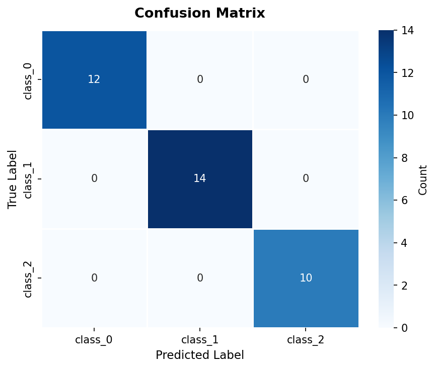
Confusion Matrix
from sklearn.metrics import confusion_matrix

cm = confusion_matrix(y_test, y_pred)

fig, ax = plt.subplots(figsize=(6, 5))
sns.heatmap(
    cm, annot=True, fmt='d', cmap='Blues',
    xticklabels=wine.target_names,
    yticklabels=wine.target_names,
    ax=ax
)
ax.set_title('Confusion Matrix', fontsize=13, fontweight='bold')
ax.set_xlabel('Predicted Label')
ax.set_ylabel('True Label')
plt.tight_layout()
plt.show()
Each cell shows the count of test samples with a given true label (row) and predicted label (column). Off-diagonal cells represent misclassifications.
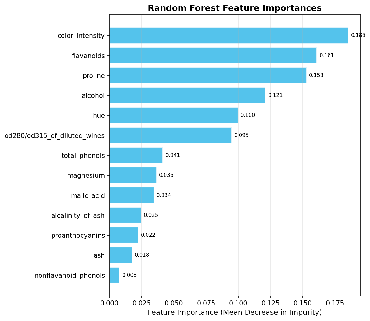
Feature Importances
importances = rf.feature_importances_
sorted_idx = np.argsort(importances)

fig, ax = plt.subplots(figsize=(8, 7))
ax.barh(range(len(sorted_idx)), importances[sorted_idx], color='#29B5E8', alpha=0.8)
ax.set_yticks(range(len(sorted_idx)))
ax.set_yticklabels([wine.feature_names[i] for i in sorted_idx])
ax.set_title('Random Forest Feature Importances', fontsize=13, fontweight='bold')
plt.tight_layout()
plt.show()
Feature importances are measured by mean decrease in impurity across all trees. Typically, proline, color_intensity, and flavanoids rank highest for the Wine dataset — consistent with the EDA observations.
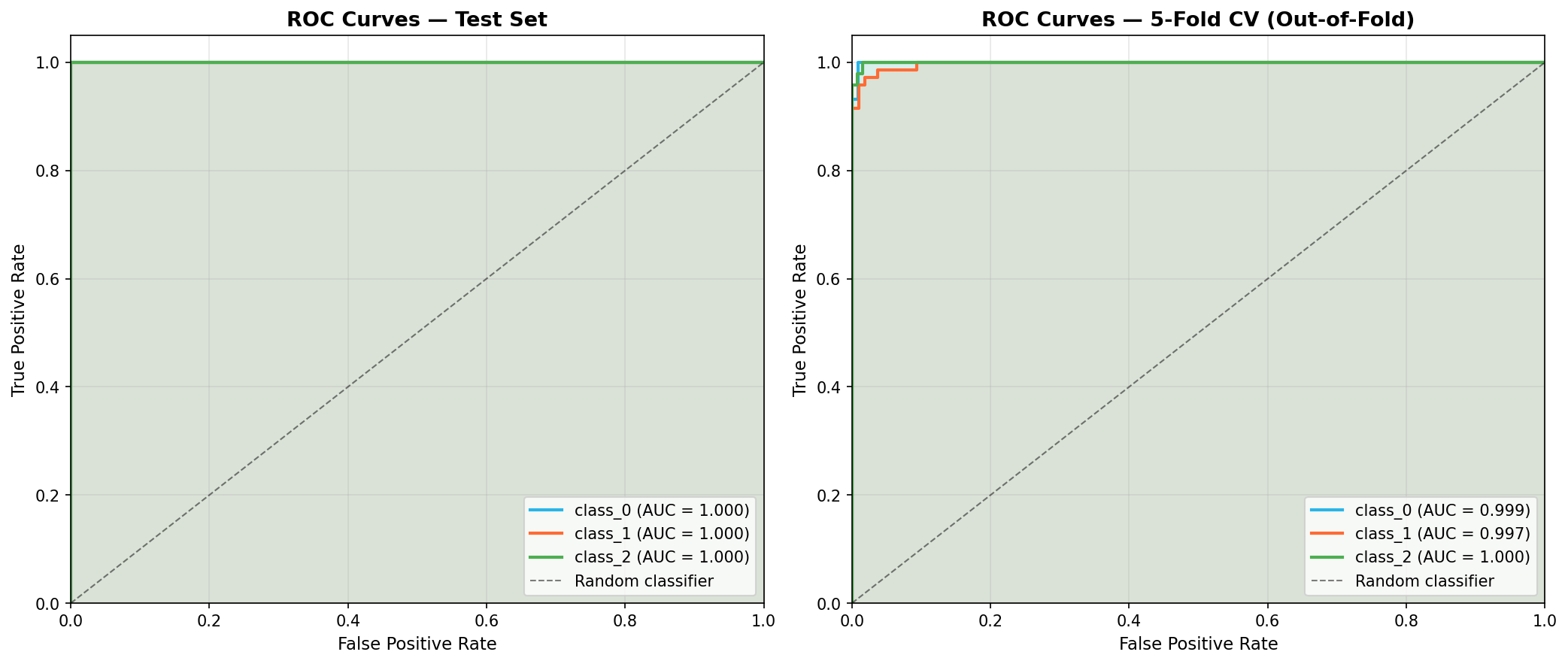
ROC Curves (One-vs-Rest)
from sklearn.preprocessing import label_binarize
from sklearn.metrics import roc_curve, auc
from sklearn.model_selection import cross_val_predict

y_bin = label_binarize(y, classes=[0, 1, 2])
X_scaled_all = scaler.transform(X)
_, X_test_all, _, y_test_bin = train_test_split(
    X_scaled_all, y_bin, test_size=0.2, random_state=42, stratify=y
)
y_score = rf.predict_proba(X_test_scaled)

y_cv_score = cross_val_predict(
    RandomForestClassifier(n_estimators=n_estimators, max_depth=max_depth, random_state=42),
    X_scaled_all, y, cv=5, method='predict_proba'
)
Two ROC panels are plotted side by side:
- Left — AUC on the held-out test set (20% of data).
- Right — AUC from 5-fold CV out-of-fold predictions (all 178 samples used for evaluation without data leakage).
Comparing the two panels lets you check whether strong test-set AUC is reproducible across multiple splits or is a lucky artifact of the particular 80/20 split.
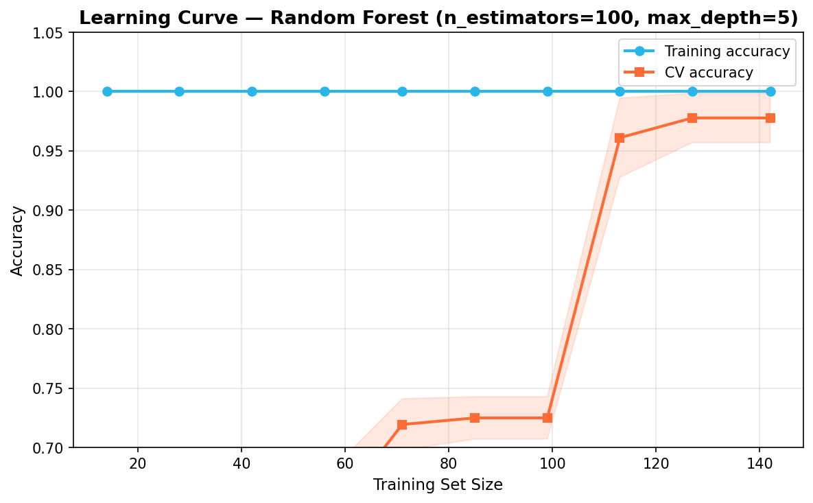
Learning Curve
from sklearn.model_selection import learning_curve

train_sizes, train_scores, val_scores = learning_curve(
    RandomForestClassifier(n_estimators=n_estimators, max_depth=max_depth, random_state=42),
    scaler.transform(X), y,
    cv=5, scoring='accuracy',
    train_sizes=np.linspace(0.1, 1.0, 10),
    n_jobs=-1
)

train_mean = train_scores.mean(axis=1)
val_mean   = val_scores.mean(axis=1)
The learning curve plots training accuracy and CV accuracy as a function of training set size. A small gap between the two curves at the rightmost point indicates the model is not overfitting and is unlikely to benefit significantly from collecting more data.
What Gets Generated
Four diagnostic plots are rendered inline:
Confusion matrix — true vs predicted labels on the test set. Diagonal cells are correctly classified samples; off-diagonal cells are misclassifications:
Feature importances — horizontal bar chart ranked by mean decrease in impurity. proline, color_intensity, and flavanoids are the top predictors:
ROC curves — one-vs-rest AUC side by side for the test set and 5-fold CV out-of-fold predictions. All three cultivars achieve AUC > 0.99:
Learning curve — training and CV accuracy vs dataset size with ±1 std shading. The narrow gap at the right indicates no significant overfitting:
Summary and Next Steps
What You Built
In this guide you built a complete end-to-end classification pipeline inside a single Snowflake Notebook:
- Setup — loaded the Wine dataset into a pandas DataFrame, connected to Snowflake via
get_active_session(), and sanitised column names for SQL compatibility. - SQL EDA — queried the in-memory pandas DataFrame directly from SQL cells using
{{df_snow}}Jinja templating to verify class balance, compare alcohol statistics, surface top flavanoid samples, and compare per-cultivar feature averages. SQL cell results are returned as Snowpark pandas (snowpandas) DataFrames (call.to_pandas()for downstream pandas operations). - Python EDA — grouped box plots revealed per-feature class separability; the 13x13 correlation heatmap identified collinear features; a pairplot of the five most discriminative features confirmed near-linear class separability.
- PCA scores plot — confirmed the stratified 80/20 train/test split is representative and that cultivars are largely separable in 2D PCA space.
- Random Forest — trained with interactive
ipywidgetssliders forn_estimatorsandmax_depth; validated with 5-fold cross-validation to confirm the result generalizes beyond the single split. - Post-ML analysis — confusion matrix identified which cultivars are misclassified; feature importances ranked proline, color_intensity, and flavanoids as the top predictors; ROC curves confirmed strong one-vs-rest AUC; the learning curve showed no significant overfitting.
Next Steps
- Try other classifiers — swap in
SVC,GradientBoostingClassifier, orLogisticRegressionin place ofRandomForestClassifierto compare performance. - Hyperparameter search — replace the manual sliders with
GridSearchCVorRandomizedSearchCVfrom scikit-learn. - Register the model — use the Snowflake Model Registry to version, log metrics for, and deploy the trained model.
- Schedule the notebook — use Notebook Scheduling to retrain the model on a cadence as new data arrives.
- Use a real dataset — replace the Wine dataset with your own table in Snowflake by reading it with
session.table()orsession.sql()instead ofload_wine().
Resources
This content is provided as is, and is not maintained on an ongoing basis. It may be out of date with current Snowflake instances